Approach :
It is with this mindset that Taste Heiven brings the product offerings to you, like family member. What we do not eat, will never be offered. What does not taste nice, we will not pass on. Hence, this brand brings the best of home cooked, comfort meals from Our Table to Yours. It is with earnest wish that every bite brings you the Taste of Heaven.
Rationale :
The centrepiece of the logo is a unique home icon (formed by the combination of the ark and tabernacle) emitting the aroma of tasty home-cooked food to depict the brand positioning of “Taste Heiven”. It brings to mind the warmth of family cooking and heirloom recipes that use the best ingredients including love and care. This align with the tagline of OUR TABLE TO YOURS… the curved plate also represents the serving table. The friendly, easy-on-the-eye typeface used for “Taste Heiven’ complements the graphic, conveying a sense of assurance that fresh and hot food will be delivered from mom’s kitchen right to your doorsteps. Using "hei" in Hebrew for Grace for the word “heiven” and to replace the letter “n”. Colours that depict natural, fresh ingredients are used to convey the feel of home. The aroma graphic is cleverly rendered to look like a thought bubble, thus depicting new culinary ideas, communicating Taste Heiven as a brand that continues to reinvent its recipes to keep pleasing taste buds.
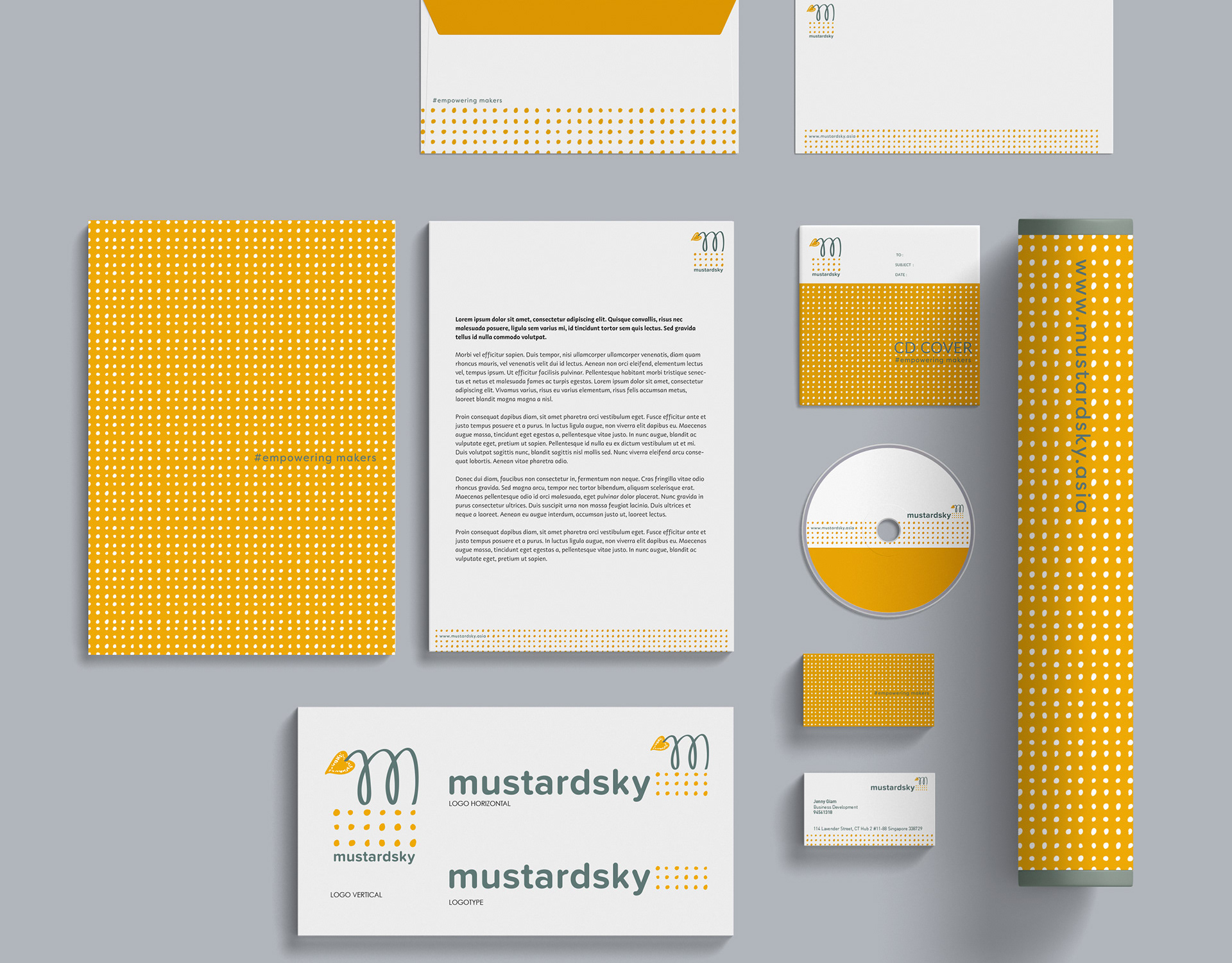
The hand-drawn new pattern evolves from the emitting aroma icon from the logo. These secondary patterns are derived from the concept of the layering of aromas to show the multi-sensory, multi-flavoured experience of gastronomy. When one tastes the creations of 'Taste Heiven', the in-depth nuances of the best ingredients that are experienced and that bring joy and leave behind lingering memories. The pattern ends with the blossoming of a flora heart shape. On the whole, the pattern also looks like the picturesque design of plates or tiles used in the kitchen, to relay and reiterate the brand promise of 'FROM OUR TABLE TO YOURS'.

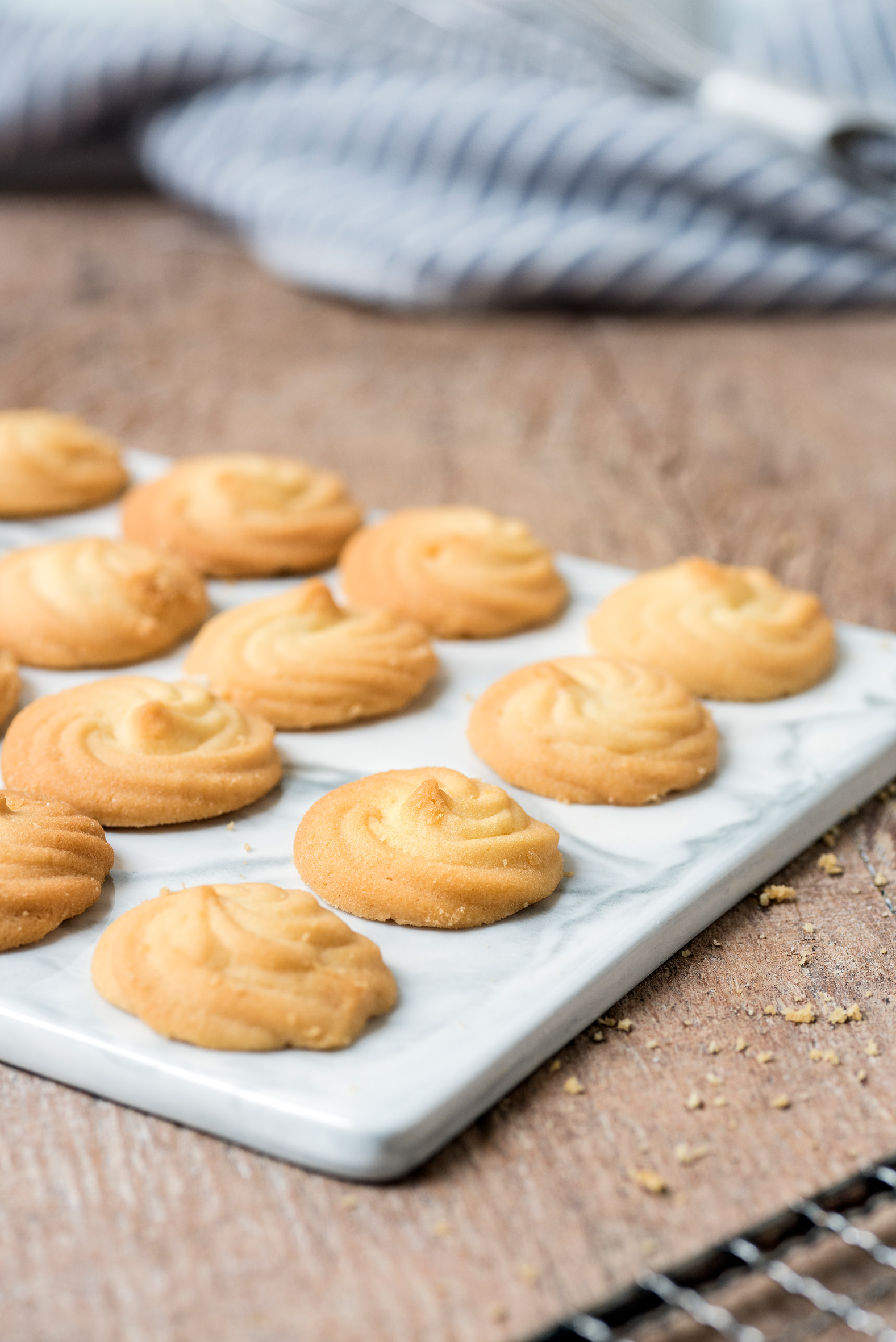
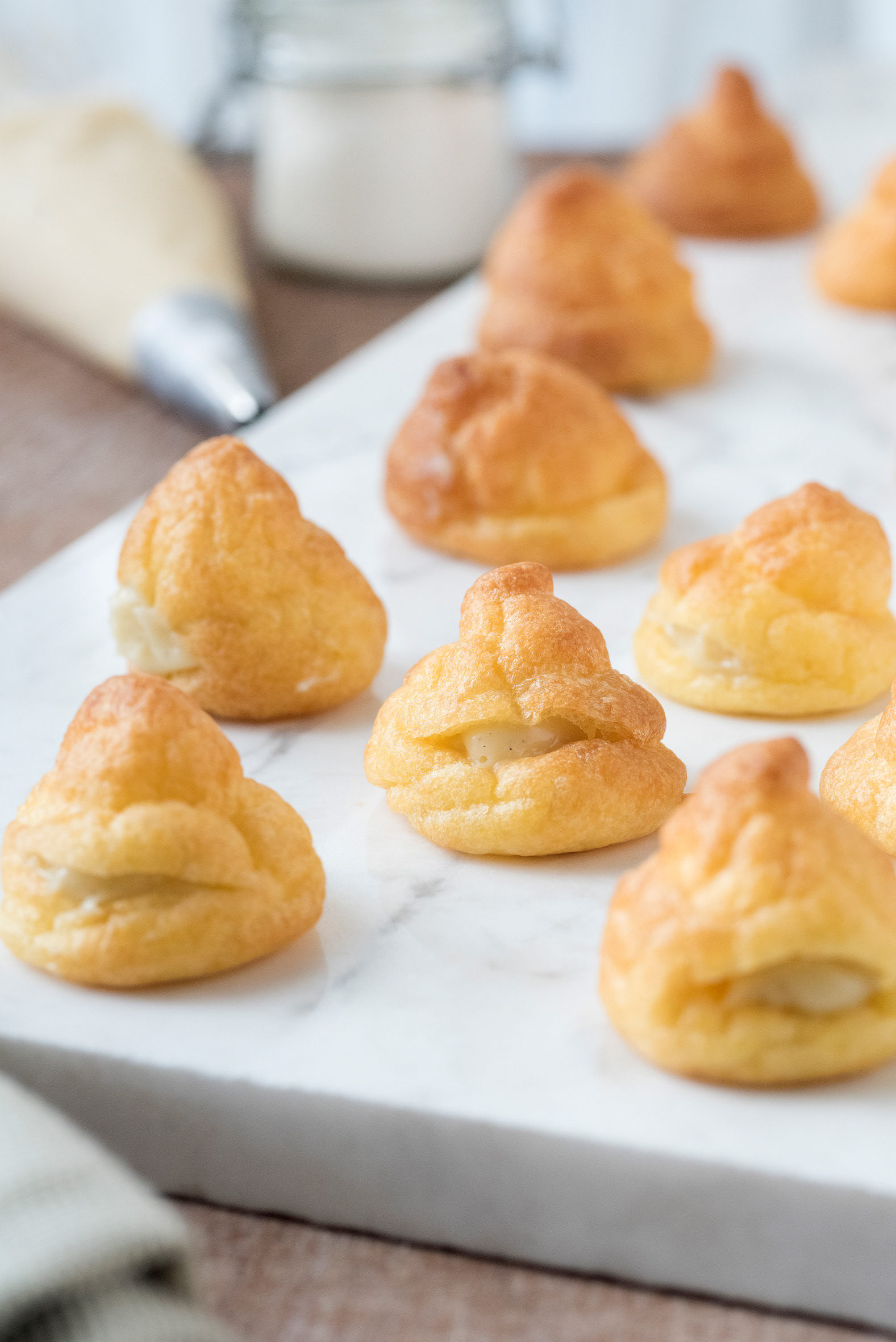
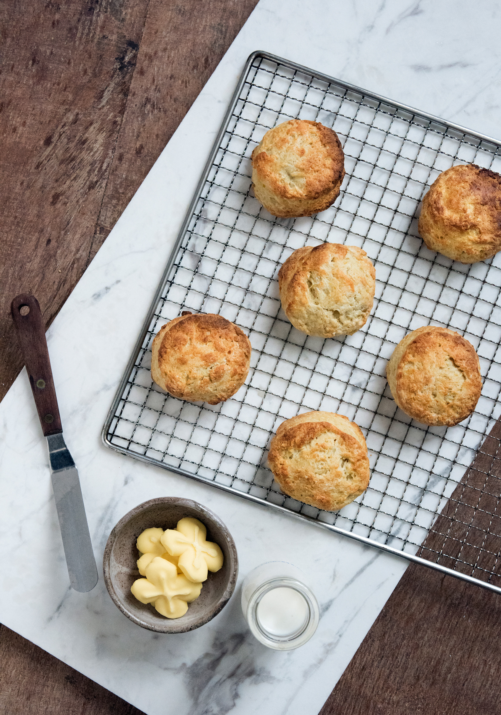
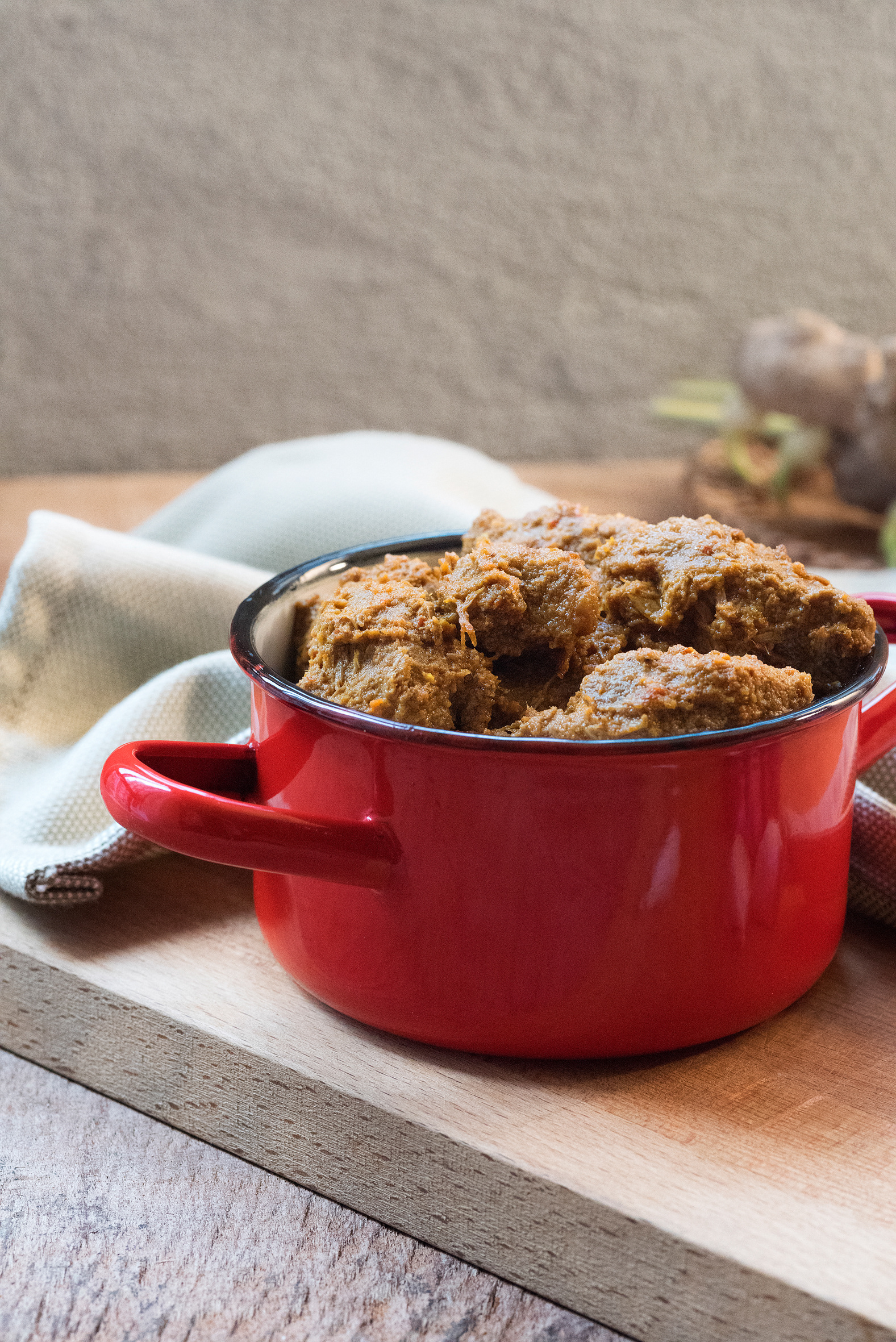
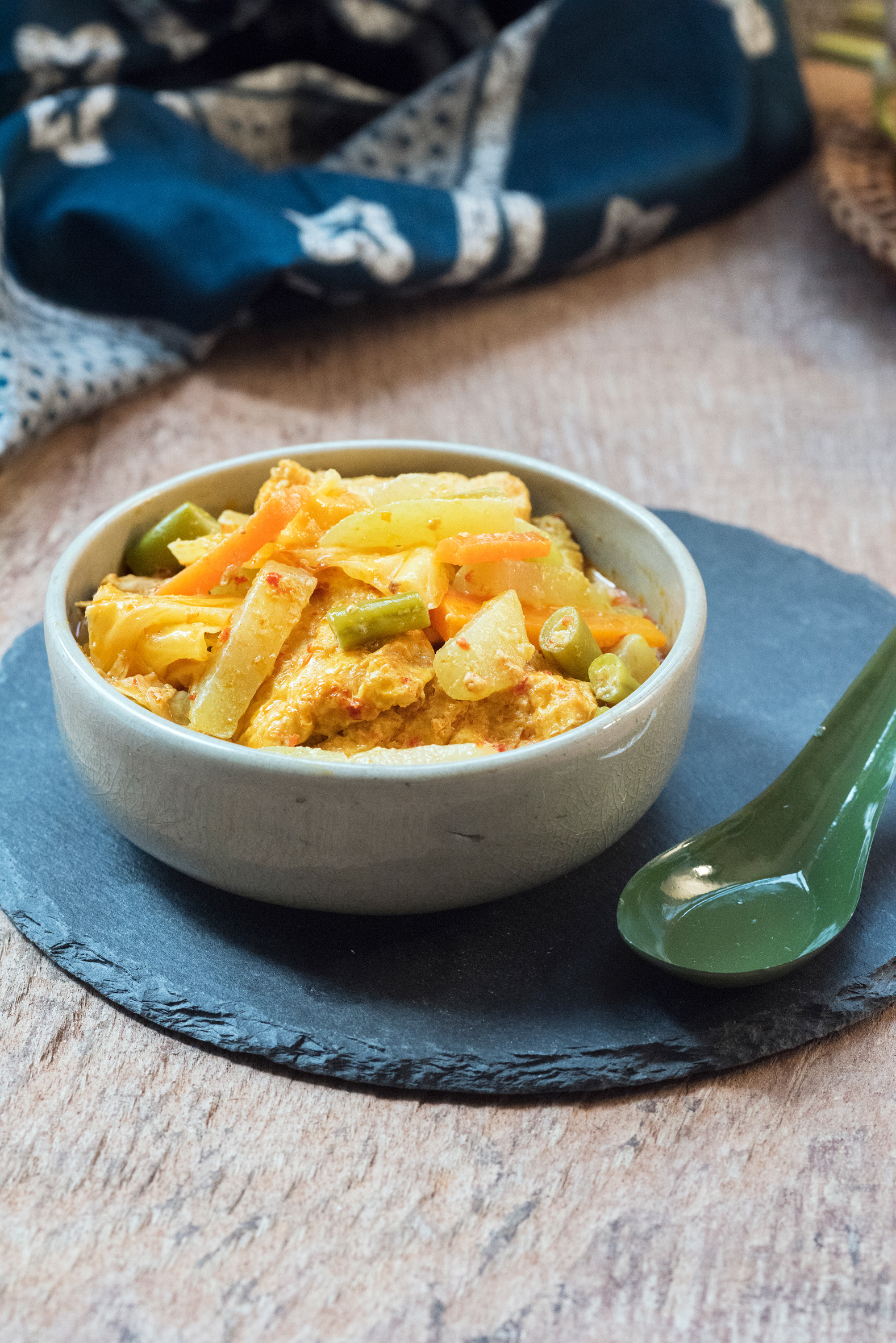
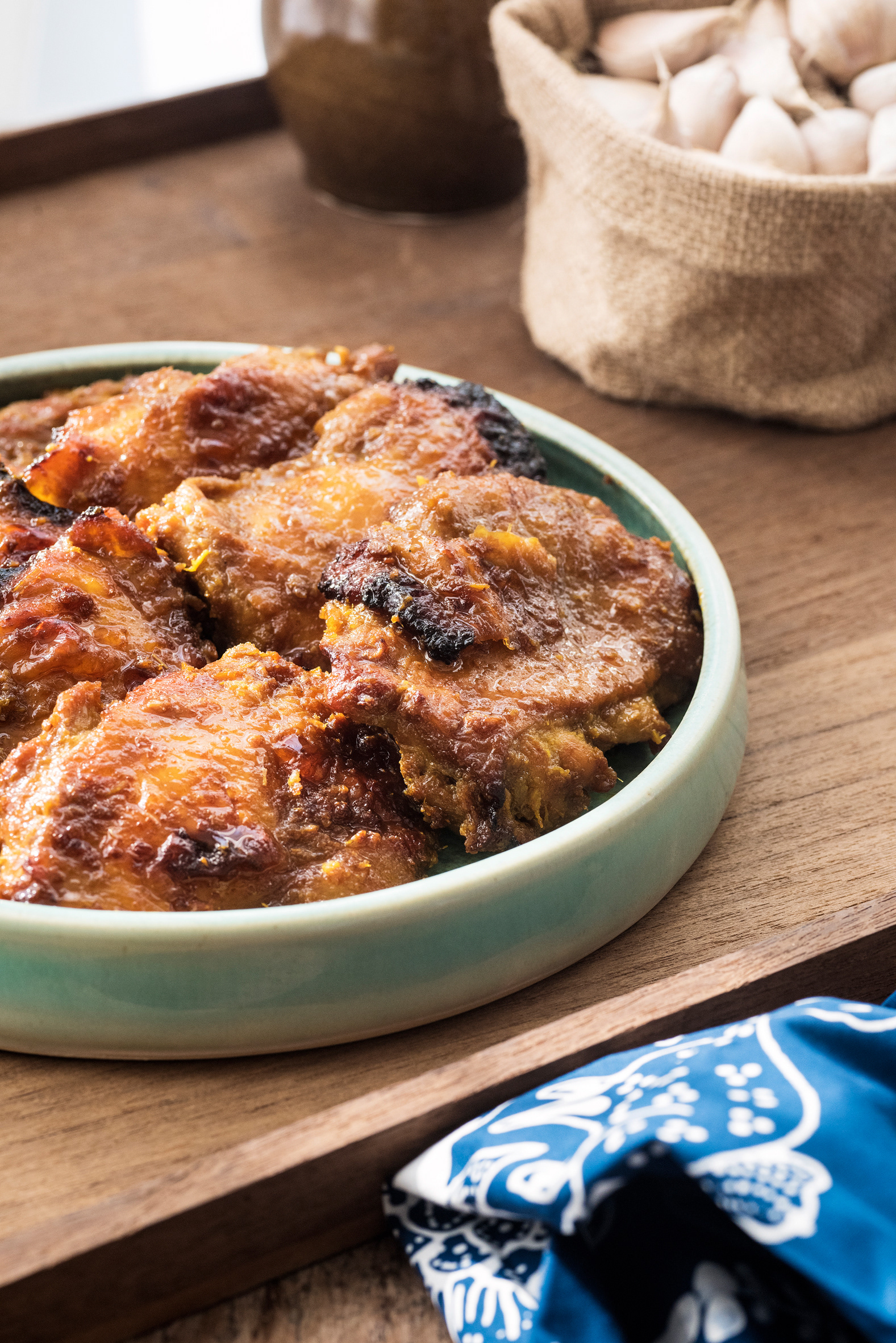
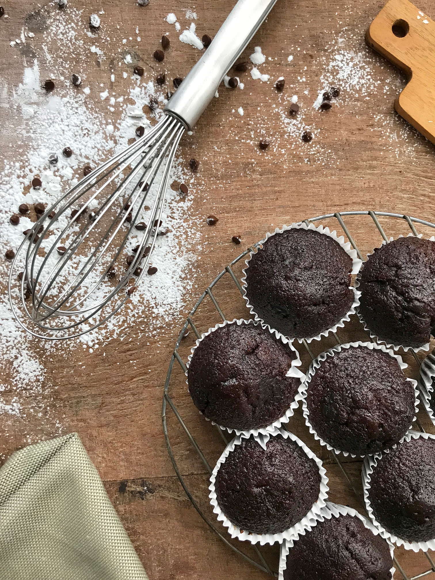
Art Direction / Food Styling and Photography for Taste Heiven

